Square TV Art Revisited

22 August 2010

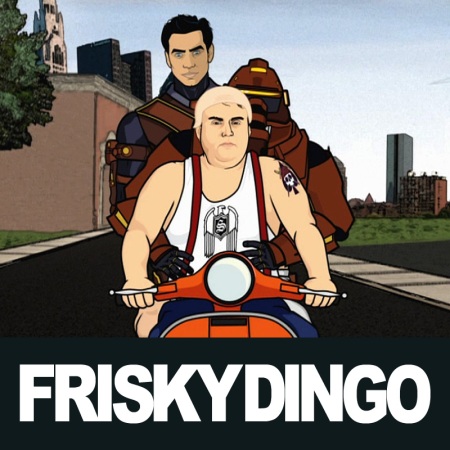
Following up my earlier post on this, I’ve now made a complete move towards square art with a footer containing the name of the TV show. I don’t know why I didn’t do this earlier. It looks so much neater than just a screen shot, because it’s always a uniform size and the footer helps with identification.

With screen shots, you’re dealing with either 4:3 or 16:9 aspect ratios (Star Wars: The Clone Wars is a rare exception–it’s presented in 2.35:1). I settled on an 800 x 800 pixel size. This allows me to scale up or down a moderate amount so as not to introduce too many artifacts. I use a footer of 300 pixels high for 16:9 content (576p scales down a little) and 200 pixels high for 4:3 (576p scales up).

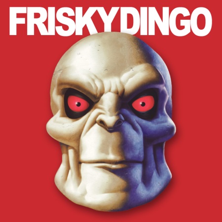
I usually use a solid colour for the footer and this is sampled from the artwork that I use for the whole season. Here’s an example:

Frisky Dingo, Season One

Frisky Dingo, Season One (Season Art)

Frisky Dingo, Season One, Episode 4, "XPO"

Frisky Dingo, Season One, Episode 4, "XPO" (Episode Art)

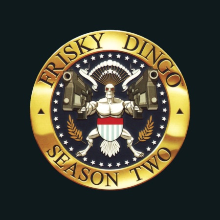
Using a sampled colour connects the season and the episode art visually. When the season art changes, so does the footer:

Frisky Dingo, Season Two

Frisky Dingo, Season Two (Season Art)

Frisky Dingo, Season Two, Episode 8, "The Debate, Part Two"

Frisky Dingo, Season Two, Episode 8, "The Debate, Part Two" (Episode Art)

It’s more work, of course, but once I’ve set up the image as a Photoshop file with the footer and the TV show title, I can then bring in my screen shots as separate layers and save out as JPEG files. That keeps all the working files together in one file, with separate output files.

You can see all the Frisky Dingo artwork on my artwork site, Album-Art.net.


Embracing the iTunes Square TV Artwork Format

2 May 2010

I don’t know why Apple chose a square format for TV artwork. Perhaps it was to distinguish TV video from movie video, for which they use a poster-like 1:1.5 ratio format.

I’ve fully embraced the square TV format because all of Apple’s devices expect it. It helps in my scanning of DVD covers, too, because here in Australia, every cover has the rating label printed on it, ruining the bottom edge. By scanning square, I can omit this section.

I’ve seen a screen shot of video on the iPad and the TV shows are displayed as thumbnails, with no text label. The person who posted it was annoyed because they couldn’t tell what the shows were. This is because he had provided his own video (not purchased from the iTunes Store) and had not used custom artwork. I can understand this. Apple intends that you buy TV shows from the iTunes Store. Every episode on the store has the same artwork. You can tell what the show is, any episode, by looking at the artwork on the iPad.

I’ve taken a different approach to the TV shows I make from DVDs. I scan the cover for the episode art, then take a screenshot from every individual episode. Every episode therefore has unique art. This helps to identify the episode but is also the best possible way to immediately refresh your memory as to the episode content for those you’ve watched in the past, or to pique interest in those you haven’t. Traditionally, I’ve retained the native aspect ratio, i.e. 16:9 or 4:3.

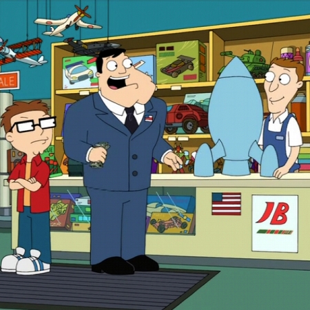
Getting back to Apple’s love of the square art, I’ve begun experimenting with squaring of the episodic artwork:

"American Dad", Season 3, Episode 13, "Red October Sky"

"American Dad", Season 3, Episode 13, "Red October Sky"

This was from a 4:3 screen shot. Cropping seems to work in almost all cases, although my experiments have been limited to American Dad, Volume 4 so far.

I recently picked up an unusual Australian TV show, Stories from the Golf. Each episode is 5 minutes long and I didn’t think that there was much to take a screen shot of, especially as there was a beautiful piece of art for each episode in the DVD menus. I took screen shots of each. None of them conformed to a particular aspect ratio, so I worked them into a 600 x 450 image. Then I had the idea to add a footer, into which I put the TV show’s name:

"Stories from the Golf", Episode 7, "Karaoke Roadie"

"Stories from the Golf", Episode 7, "Karaoke Roadie"

This has started a whole new chain of thought. I’m now experimenting with combining screen shots with a similar footer:

"Very Small Business", Episode 1, "Basics of Team Building"

"Very Small Business", Episode 1, "Basics of Team Building"

I had to crop the 16:9 image slightly to 800 x 500. There is a 300-pixel footer. This gives me the best of both worlds-screen shot and identification, all in a square package. I’ll keep doing this for a while to see if I still like it. It’s a radical change.

You can pick up the episodic art for these shows from my album-art website:

American Dad

Stories from the Golf

Very Small Business


Squaring Up Your Album Art

21 October 2008

For some time, iTunes has preferred square art. I first noticed this when the iTunes Store went live here in Australia. iTunes Store versions of landscape art would be modified to be square. In some cases, they appeared to be using a square cover from perhaps a vinyl single, in other cases, the artwork was chopped.

As a CD collector, I get a number of landscape covers in the form of CD singles, digipaks and slipcased jewel cases. About two years ago I began to produce square versions of landscape covers. If I want to be intellectual about what I do with my scanning, I would call myself a “reproduction artist”, “translating the artist’s vision from CD cover to digital image form”. I do try to reproduce, as accurately as possible, the full image and colour balance of the original. That means I scan the full landscape cover, for purists. However, given Apple’s products’ propensity to favour square art has led me to modify the landscapes into additional square forms. The iPod will either crop a landscape cover or add white bars to top and bottom. The iPhone will add the unsightly bars:

AC/DC • Black Ice Landscape Artwork on iPhone

AC/DC • Black Ice Landscape Artwork on iPhone

If possible, I merely crop either side down from 1130 x 1000 to 1000 x 1000. In some cases, this would crop text, so the elements need to be reworked. Here I’ve scanned the digipak version of ’74 Jailbreak:

AC/DC • '74 Jailbreak (Digipak Landscape) (Click to enlarge)

AC/DC • '74 Jailbreak (Digipak Landscape) (Click to enlarge)

To create this square version, I cropped the left side and shrank the artist name and title slightly to fit:

AC/DC • '74 Jailbreak (Square Version) (Click to enlarge)

AC/DC • '74 Jailbreak (Square Version) (Click to enlarge)

This is a somewhat complex cover. In most cases, you can just crop. I also refer to images on the internet to get an idea of what to modify in order to achieve a square shape. Luckily, a lot of titles still come out on vinyl, and of course they are square.

So with a little artistic licence, I can create artwork that is optimised for iTunes, iPod, iPhone and Apple TV. I post both versions on my album art site.


Net Labels: Free Music for the Taking

16 October 2008

A net label is a website that offers free music. It is distinguished from a site that offers a random selection of tracks by these factors:

  • The music is organised into titles, analogous to singles, EPs, albums and compilations
  • Often the work of a single artist is the subject of a title
  • Artwork accompanies the title, often of high resolution and intended for printing, so that jewel cases can be created for the title if burned to CD.

The music is given away for free. There are a number of reasons for this. The artist doesn’t want to release commercially, they are a hobbyist, the free work is promotional, etc. This means it’s legally free and legal to give to others. Often a Creative Commons licence is employed.

Those raised on a diet of commercial music will ask if the music is any good. In my opinion, the music from net labels is often very good in terms of skilled technical execution and aesthetic appeal. Rarely do I feel that a track is amateur. The point of the net label is to treat an artist’s music with respect and thus the resemblance to a commercial label operation.

I like music I can chill out to, so I have focussed on net labels that provide this type of music. Here is a list of sites that I consider to be the best.

  • Alpine Chic: Swiss electronica at its best.
  • iD.EOLOGY: German electronica, dub and hip hop.
  • Mercedes-Benz Mixed Tape: Awesome ephemeral compilations released every six weeks. A marketing vehicle for Mercedes, promoting it as a lifestyle brand. Each compilation is a mix of electronica, pop, RNB and hip hop, sometimes featuring known artists, but mostly a platform to present up-and-comers. As each new compilation is released, the previous is deleted, so these are collectables.
  • Jahtari: Amazing blend of low-tech computer music and reggae and dub. It really works.
  • Lo-Kiwi: Electronica.
  • Petit Poulet Records: Electronica.

These sites vary in that they can be considered net labels for individual artists, in other words, their own label. They still present their music in titles, so I consider them net labels.

These sites are still good, but I don’t always like the music. That’s just my opinion of course. The music still has that skilled technical execution, so it’s still good.

  • Monotonik & Friends: Huge repository of electronica and glitch/bleep (scratchy-sounding music created with low-tech computers). The titles vary widely in style, thus I don’t like everything on the site.
  • Autoplate/Thinner: Sister sites that specialise in glitchy electronica.
  • Electrobel: Electronica, some glitchy.
  • Offaudio: Spanish site. Beatier, dancier electronica.
  • One: Electronica.

Tagging is the one area in which they fall down. The tags are incomplete and lack artwork. Artwork is supplied separately, of course, except in the rarest of situations, and can be reformatted for use as album artwork. The Mixed Tapes are the worst, because the album tag is different for every song and the compilation flag is not used. I like fixing these tags, however, and this, in combination with my dissemination of the music, is my contribution to their efforts.

To keep track of the various releases, I tag the Grouping field with the website and the release number. Often there will be a specific release number, such as iD049 (iD.EOLOGY). If none, I number from the earliest, starting with 01. A title may end up with a Grouping tag something like this: http://www.ideology.de (iD049). I then create a smart playlist that looks for all tracks with http://www.ideology.de in the Grouping field, and that’s my iD.EOLOGY playlist.

Net labels have serious works available to you for free. Use them well to greatly expand your music library.


iTunes 8 Subtleties

15 September 2008

As I was skimming through albums in Grid view, by Artist, it struck me that the grid art was always the first title in alphabetical sequence. I wondered if I could change this to another cover as in iPhoto, by pressing the spacebar when hovering over a cover. Being iTunes, this of course started playing the first song from the first album for that artist. However, I found that if you skim to the cover that you want to represent the artist, right-click and select Set Default Grid Artwork, this will have the desired effect:


There’s a new Description tag in the Video tab:


(Click to enlarge)

You can use this to tag either audio or video. Note that while you can enter a huge amount of characters in this field, analysis with Lostify reveals that this is the short description, and anything over 256 characters is truncated when written to the file. If you import the file into another iTunes library, the description will be truncated.


In the Options tab, you can set whether an audio file is Music or an Audiobook:


(Click to enlarge)

or if a video file is a Movie, TV Show or Music Video


(Click to enlarge)

These are contextual based on file type and the tag is written to the file, not just the database, which is what earlier iTunes versions did. This is a good thing when transferring files to other iTunes libraries. Note that all these and more (Ringtone, etc.) are taggable in Lostify.


Nice new tagging options, but I’m going to stick with Lostify, as it still can access more tags than iTunes 8.


Subtle Changes to iTunes 7.7

12 July 2008

In my usual function of pointing out things that other, swifter sites may have missed, here is a 7.7 subtlety round-up.

Firstly, a bad one: With AAC files ripped under 7.7, Lostify is broken. It doesn’t recognise the files as valid MPEG 4 files, so you can’t edit the extended tags such as File Kind, Release Date and Copyright.

Album Art in iTunes 7.7
(Click to enlarge)

Album art in iTunes is magnified to fill the screen, regardless of original resolution. All my 400 x 400s now look huge and blocky. I don’t know if I like this beyond it being a prompt to upgrade my artwork. If the art is oddly sized and low-res, like for this podcast, it’s a little unsightly at full screen. This is from a 1920 x 1200 monitor.

Artwork at maximum size used to go below the dock, but now it doesn’t, which is a nice enhancement for artwork enthusiasts.

Remote

You’ll hear a lot about Remote for iPhone/iPod Touch, but I just wanted to register that it is jaw-droppingly well done. No other company could produce a remote so tightly integrated with iTunes and the Apple TV. The response time between interacting with the screen and playback is instantaneous. If you’ve set up AirTunes with an Airport Express or Apple TV, you can select which speakers you want to use, just like you can in iTunes.

I was playing a video on Apple TV, then paused it, changed control to iTunes on the computer and started playing an audio track, with the output going to the Apple TV using the AirTunes feature. Instead of the Apple TV choking, it simply displayed the album art and track information in the lower-left of the screen, then changed to the audio Now Playing screen. This is very impressive.

So, apart from support for the major features of iPhone/iPod Touch, some small tweaks. I’m not expecting any more, but will post if I do.


iTunes 7.6 Subtleties

7 February 2008

Focussed on movie rentals as it may be, 7.6 introduces some subtle bug fixes and welcome behavioural changes, some of which we’ve been asking for for some time.

Bug Fixes

As long as I can remember, iTunes by default used the constant bitrate (CBR) method of encoding, resulting in neat bitrate values such as 128 and 256. The last version of QuickTime was updated to include further bitrate encoding methods. iTunes then dropped the ball and users noticed that their rips now all had varying bitrates, plus or minus the value specified. Apparently iTunes wasn’t told to continue using CBR and started using one of the newer methods. This has now been fixed. Rerip your CDs and your bitrates will be neat again.

Enhancements

Podcasts Option Menu

Something that hasn’t made sense for a long time has now been addressed. Until now you could not sync a number of “least recent new” added podcasts, only “most recent”. This has now been added and it makes things a lot easier. For example, if I download a lot of podcast episodes at once (as is common when I discover a podcast), they would rapidly fill my 4Gb Nano, which is my main podcast iPod. The solution was to uncheck a number of episodes. With “Only sync checked songs” and “Sync unplayed episodes” set, this made it manageable. It adds work, however, as you have remember to check newer episodes as older played episodes come off the iPod. Now I can leave them all checked and by syncing only the 3 episodes least recently added, I avoid filling my iPod prematurely and don’t have to think about it. This is a very welcome change.

You have both the option for “unplayed” and “new”, which seems a little redundant. “Unplayed” means that whether or not a podcast has been started, it does not have a play count higher than 0. “New” means that a podcast has never been started. I guess if you only wanted podcasts that you’ve never played, not including unfinished ones, this would be a usable distinction.

TV Shows Option Menu

Similarly, TV shows now have a new “least recent unwatched” option which finally resolves the stupidity of buying a whole season of a TV show but only being able to sync a certain number of “most recent unwatched” episodes. The focus here is still very much on the basis of only watching an episode once. If you are happy with that, then this solves it right here for you, but if you like to cycle through your episodes, you should resort to my TV Rotation Technique.

Blackadder Series

TV Shows in Album view are now subdivided into seasons, each marked by the album art for the first episode in a season. If you scan the box art for individual DVD sets like myself, this feature vindicates this approach. Looks nicer.

You can now manually manage iPhones and iPod Touches, if you wish. Still not available as drives on the desktop, however.

To Be Addressed

Apple TV does not support these new sync options but it is reasonable to expect that the imminent update will address this.

Unfortunately, you still can’t make a smart playlist select items by Show, as covered in this post. Hopefully this will come. The inclusion of the elusive “least recent new” feature above, at least for podcasts, is very heartening.

I wasn’t expecting anything more than rental support (by the way, this Australian is gnashing his teeth at this being US-only, although it’s not a surprise), so I’m happy that Apple squeezed in some further refinements.

Cover Flow on iPod: Why it’s Good

12 September 2007

iPod Classic, Cover Flow

Okay, so Cover Flow is a little small on the 3rd-Gen Nano and the Classic, but it sure beats scrolling through a list of text. I’ve wanted this for a while, as I’m intimately familiar with the covers of my albums and think of them in visual terms. This is especially good on a Classic, where thousands of albums can be housed. Trying to visualise the albums from the text listing on old iPods leads to overlooking a lot of music because it’s too hard to do rapidly while scrolling.

The interface is not bad on the new iPods. You scroll with the scroll wheel, then click to spin a cover around. Click a track and it starts playing. Press Menu to go back to Cover Flow. It remembers the last cover it was displaying, even after a sync.

Here’s something insanely cool: I’ve just discovered that with the iPod in the Universal Dock (first version), in Cover Flow view, you can actually scroll left and right with the remote! How cool is that? It’s a little limited compared to using the wheel itself. You can’t rapidly scroll by holding down the button and if you click Play/Pause, it immediately starts playing the album from the beginning rather than presenting the songs for selection. But this is a nice hidden interface detail. Perhaps the dock will interact with the iPod in more ways in the future.

I can’t wait for my Touch, to play with that Cover Flow.


Artwork in the New iPod Landscape

10 September 2007

iPod Nano 3rd-Gen

Been a bit lax in tagging your music with artwork? Well if you get a new iPod, you are going to notice just how important artwork is to the interface. The Nano and Classic interface has advanced astonishingly and features artwork on the righthand side of the screen in menu mode and thumbnails in list views. The Touch will use artwork even more strikingly, filling most of the screen with a cover in portrait mode. And it should be obvious how critical artwork is to CoverFlow, now standard on three of the four iPod models.

It’s not like you don’t have options. The easiest is to update to the latest version of iTunes (which you really should do often) and check the option Automatically download missing album artwork in the General tab of the Preferences. When you import a CD, iTunes will try to find a match in the iTunes Store and will automatically download it. You can do the same thing for CDs you’ve already ripped by clicking one of the tracks and selecting “Get Album Artwork”.

I’ve covered the subject of artwork before. It’s near and dear to my heart. I don’t want to see these new iPods with missing artwork because you will be missing out on the full experience as these iPods are more visual than ever before.

*PS: Get some high-quality artwork from my own site, Album-Art.net. The interface is crude (folder listings) but the artwork is good. My standard is 1000 x 1000 pixels, 100% JPEG quality, colour-corrected. A lot of the artwork is currently at this standard. I’m always adding new covers and upgrading older ones, so you’ll find some useful stuff.


Basic DVD-Ripping Steps

20 April 2007

May 3 2007: Note: The video specs are now out of date, but the outline of the procedure is still the same.

I should get on with some video-ripping specs. This is the broad outline. I’ll get specific later.

Ripping

Start with Handbrake or MediaFork. Both are essentially the same application. MediaFork is slightly more configurable. Rip using the following specs:

Video

  • H.264 (main): 2500 kbps
  • 2-pass encoding
  • If a grey-scale movie, check Gray Scale
  • 4:3 content: 640 x 480
  • 16:9 content: 720 x 400

Audio

  • Stereo option, if available, otherwise 5.1 will be down-mixed to stereo
  • 192 kbps

Tagging

Next step is tagging. We use Lostify for this. Once done, drag into iTunes.

Cover Scan

Scan the cover of the DVD and add this to each track, if from a movie or music video DVD, or the image pane of the first episode in a season if a TV show

TV Show “Album Art”

For TV shows, we use a frame that best describes the episode for individual “album art” on each. Using QuickTime Player, open each video file and copy a frame. Save these in JPEG format.

In iTunes, open each episode one by one and replace the automatic album art with the appropriate frame. For the first episode of any season you will get two images for that episode–the DVD cover and a frame.

There’s a lot of detail to each step but I wanted to blurt out the overall procedure before getting technical.