Square TV Art Revisited

22 August 2010

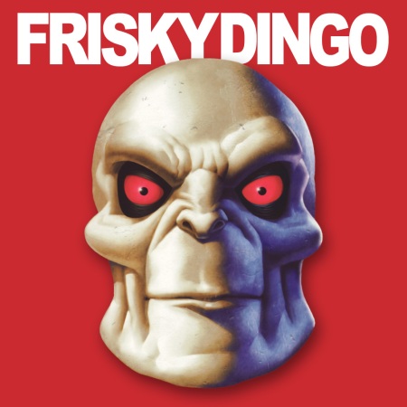
Following up my earlier post on this, I’ve now made a complete move towards square art with a footer containing the name of the TV show. I don’t know why I didn’t do this earlier. It looks so much neater than just a screen shot, because it’s always a uniform size and the footer helps with identification.

With screen shots, you’re dealing with either 4:3 or 16:9 aspect ratios (Star Wars: The Clone Wars is a rare exception–it’s presented in 2.35:1). I settled on an 800 x 800 pixel size. This allows me to scale up or down a moderate amount so as not to introduce too many artifacts. I use a footer of 300 pixels high for 16:9 content (576p scales down a little) and 200 pixels high for 4:3 (576p scales up).

I usually use a solid colour for the footer and this is sampled from the artwork that I use for the whole season. Here’s an example:

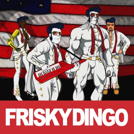
Frisky Dingo, Season One

Frisky Dingo, Season One (Season Art)

Frisky Dingo, Season One, Episode 4, "XPO"

Frisky Dingo, Season One, Episode 4, "XPO" (Episode Art)

Using a sampled colour connects the season and the episode art visually. When the season art changes, so does the footer:

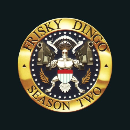
Frisky Dingo, Season Two

Frisky Dingo, Season Two (Season Art)

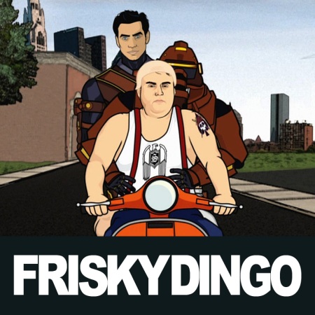
Frisky Dingo, Season Two, Episode 8, "The Debate, Part Two"

Frisky Dingo, Season Two, Episode 8, "The Debate, Part Two" (Episode Art)

It’s more work, of course, but once I’ve set up the image as a Photoshop file with the footer and the TV show title, I can then bring in my screen shots as separate layers and save out as JPEG files. That keeps all the working files together in one file, with separate output files.

You can see all the Frisky Dingo artwork on my artwork site, Album-Art.net.


Embracing the iTunes Square TV Artwork Format

2 May 2010

I don’t know why Apple chose a square format for TV artwork. Perhaps it was to distinguish TV video from movie video, for which they use a poster-like 1:1.5 ratio format.

I’ve fully embraced the square TV format because all of Apple’s devices expect it. It helps in my scanning of DVD covers, too, because here in Australia, every cover has the rating label printed on it, ruining the bottom edge. By scanning square, I can omit this section.

I’ve seen a screen shot of video on the iPad and the TV shows are displayed as thumbnails, with no text label. The person who posted it was annoyed because they couldn’t tell what the shows were. This is because he had provided his own video (not purchased from the iTunes Store) and had not used custom artwork. I can understand this. Apple intends that you buy TV shows from the iTunes Store. Every episode on the store has the same artwork. You can tell what the show is, any episode, by looking at the artwork on the iPad.

I’ve taken a different approach to the TV shows I make from DVDs. I scan the cover for the episode art, then take a screenshot from every individual episode. Every episode therefore has unique art. This helps to identify the episode but is also the best possible way to immediately refresh your memory as to the episode content for those you’ve watched in the past, or to pique interest in those you haven’t. Traditionally, I’ve retained the native aspect ratio, i.e. 16:9 or 4:3.

Getting back to Apple’s love of the square art, I’ve begun experimenting with squaring of the episodic artwork:
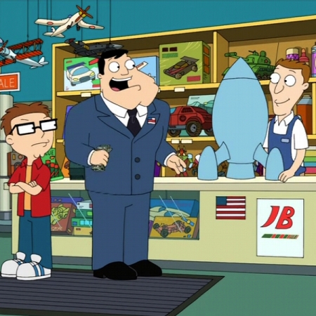
"American Dad", Season 3, Episode 13, "Red October Sky"

"American Dad", Season 3, Episode 13, "Red October Sky"

This was from a 4:3 screen shot. Cropping seems to work in almost all cases, although my experiments have been limited to American Dad, Volume 4 so far.

I recently picked up an unusual Australian TV show, Stories from the Golf. Each episode is 5 minutes long and I didn’t think that there was much to take a screen shot of, especially as there was a beautiful piece of art for each episode in the DVD menus. I took screen shots of each. None of them conformed to a particular aspect ratio, so I worked them into a 600 x 450 image. Then I had the idea to add a footer, into which I put the TV show’s name:
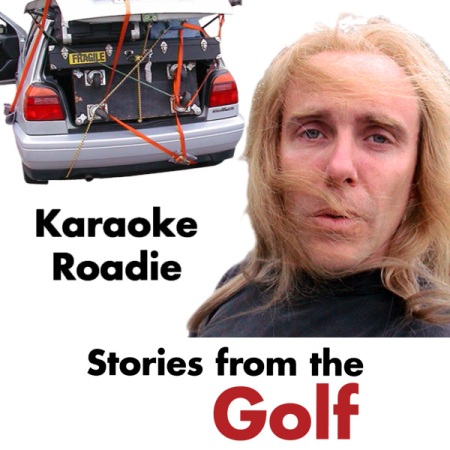
"Stories from the Golf", Episode 7, "Karaoke Roadie"

"Stories from the Golf", Episode 7, "Karaoke Roadie"

This has started a whole new chain of thought. I’m now experimenting with combining screen shots with a similar footer:

"Very Small Business", Episode 1, "Basics of Team Building"

"Very Small Business", Episode 1, "Basics of Team Building"

I had to crop the 16:9 image slightly to 800 x 500. There is a 300-pixel footer. This gives me the best of both worlds-screen shot and identification, all in a square package. I’ll keep doing this for a while to see if I still like it. It’s a radical change.

You can pick up the episodic art for these shows from my album-art website:

American Dad

Stories from the Golf

Very Small Business

Squaring Up Your Album Art

21 October 2008

For some time, iTunes has preferred square art. I first noticed this when the iTunes Store went live here in Australia. iTunes Store versions of landscape art would be modified to be square. In some cases, they appeared to be using a square cover from perhaps a vinyl single, in other cases, the artwork was chopped.

As a CD collector, I get a number of landscape covers in the form of CD singles, digipaks and slipcased jewel cases. About two years ago I began to produce square versions of landscape covers. If I want to be intellectual about what I do with my scanning, I would call myself a “reproduction artist”, “translating the artist’s vision from CD cover to digital image form”. I do try to reproduce, as accurately as possible, the full image and colour balance of the original. That means I scan the full landscape cover, for purists. However, given Apple’s products’ propensity to favour square art has led me to modify the landscapes into additional square forms. The iPod will either crop a landscape cover or add white bars to top and bottom. The iPhone will add the unsightly bars:

AC/DC • Black Ice Landscape Artwork on iPhone

AC/DC • Black Ice Landscape Artwork on iPhone

If possible, I merely crop either side down from 1130 x 1000 to 1000 x 1000. In some cases, this would crop text, so the elements need to be reworked. Here I’ve scanned the digipak version of ’74 Jailbreak:

AC/DC • '74 Jailbreak (Digipak Landscape) (Click to enlarge)

AC/DC • '74 Jailbreak (Digipak Landscape) (Click to enlarge)

To create this square version, I cropped the left side and shrank the artist name and title slightly to fit:

AC/DC • '74 Jailbreak (Square Version) (Click to enlarge)

AC/DC • '74 Jailbreak (Square Version) (Click to enlarge)

This is a somewhat complex cover. In most cases, you can just crop. I also refer to images on the internet to get an idea of what to modify in order to achieve a square shape. Luckily, a lot of titles still come out on vinyl, and of course they are square.

So with a little artistic licence, I can create artwork that is optimised for iTunes, iPod, iPhone and Apple TV. I post both versions on my album art site.