Taggin’ with Louis C.K.

17 December 2011
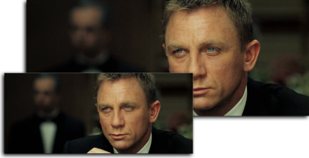
Louis C.K. Live at the Beacon Theater

Louis C.K. Live at the Beacon Theater. Click to enlarge.

I just got on this bandwagon. Louis C.K. is doing something pretty special with this special. I bought it, expecting to download an SD 640 x 360 video file, probably in H.264. I was pleasantly surprised to find that there were two sizes available, 720p and a just-under-NTSC 800 x 448 SD version, both in an iTunes-friendly H.264/AAC format. I downloaded both. They were not prepared for iTunes, so I figured this was a perfect opportunity to create a tutorial on the subject.

The two files will become what I call a “HD•SD” package, which is an iTunes Store standard that includes a 720 HD file and an SD file. They appear as one item in iTunes with a HD•SD badge:

Appearance in iTunes

Appearance in iTunes

Mr C.K. was canny enough to provide an actual DVD label on his site, so I didn’t have to cobble together art. I downloaded the PDF, cropped it, resized it, added a little black at the bottom to get my 1000 x 1500 pixel ratio, and saved it as a new file. You can download it from here.

We then open both files in Subler. Edit one, then copy the tags to the other. I’ll start with the HD version. Click the Other Settings tab:
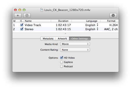
Editing, Stage 1

Editing, Stage 1

Change the Media Kind to Movie. Because this is the HD version, check the HD Video checkbox.

Click the Artwork tab and drag in your edited artwork file:
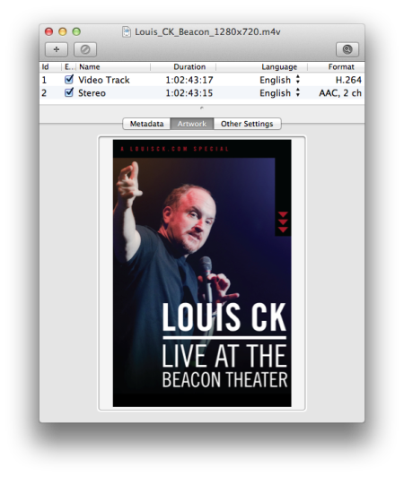
Editing, Stage 2

Editing, Stage 2.

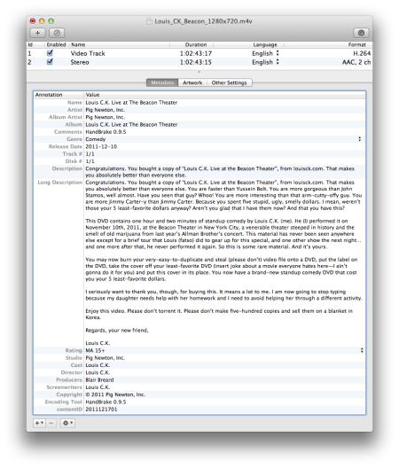
Finally, we fill out the tags. Special notes:

  • All the data for the tags came from Louis’ site and the DVD label. You can download a PDF from here that contains all the data for the below tags.
  • The Artist, Album Artist and Studio are all the same: the name of the studio, in this case, Pig Newton, Inc.
  • I like to put the encoding tool in the Comments tag so that I can use playlists to find videos encoded with HandBrake 0.9.5 (you can’t use the separate Encoding Tool tag as a criterion). Interestingly enough, Encoding Tool was the only tag these files originally had, and the value was HandBrake 0.9.5, so Mr. C.K. uses the same tool that I do!
  • I’ve used the Australian rating that I guessed applied, which is MA15+. Choose the appropriate rating for your country.
  • The tag contentID is a unique code that the two files must share. iTunes sees this code and knows that it must bundle the two files together. I use the date, followed by a sequential number, so for the first set that I tag on 17 December 2011, it becomes 2011121701. The second set of two will become 2011121702, etc.
Editing, Stage 3

Editing, Stage 3. Click to enlarge.

Do the same process for the SD version, except you won’t check the HD Video checkbox. Select All of the tags in the Metadata tab, copy and paste into the other window. Save both and drag them into iTunes where they will be filed appropriately.

I tested the files, too. The HD version works on the old Apple TV, the Apple TV 2 and the iPad (and will also work on the iPhone). The SD version will not sync to a Classic, unfortunately, but given that I never watch movies on my Classic, it’s no great loss. You’ll use the SD version on your iPhone or iPad to save space.

I hope this is useful to all who buy the special and is my contribution (other than payment) to Mr. Louis C.K.’s grand experiment.

Roll Your Own Anamorphic iPod-Compatible Videos from Blu-ray

27 August 2011
HD and SD Versions

HD and SD Versions (click to enlarge)

My job has changed recently and now involves travel, so suddenly I have a use for SD versions of videos. Previously I would only rip a HD version of a Blu-ray.

The iPod Classic is the reference device for SD video in the iTunes ecosystem. It has an ostensible limit of 640 x 480 pixels. This can be stretched to 855 x 480 with the anamorphic flag switched on. This is possible to do with anamorphic DVDs in HandBrake.

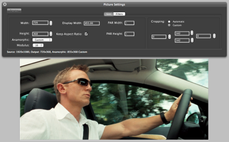
However, Blu-ray is natively widescreen, 1920 x 1080, so there’s no such thing as anamorphic ratios. In order to produce an iPod-compatible anamorphic video, you have to tweak the dimensions. Here are the settings for this movie, which is in an aspect ratio of 2.40:1:

HandBrake Settings

HandBrake Settings (click to enlarge)

I used the Universal preset. The result:

Result in iTunes

Result in iTunes


TV Rotation Technique Redux: the “Blue Dot” Technique

17 February 2011
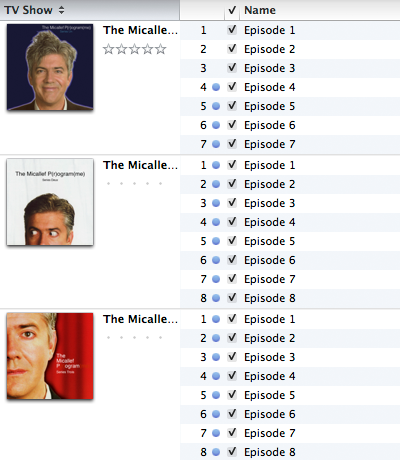
TV Show with Blue Dots

More obscure TV: The Micallef P(r)ogram(me), with unwatched episodes indicated by blue dots

A lot has changed in the Apple TV space since I first wrote my TV Rotation Technique. A friend of mine got the new Apple TV and started to manage his TV shows by “the blue dot”, the indicator that iTunes uses to indicate that an episode has not yet been played. On the new Apple TV, you see every single episode and he uses the blue dot to tell which episode is next to watch in sequence. Once he’s finished all episodes, he selects them in iTunes, right-clicks and selects “Mark as Unwatched”. Then he starts again.

I use the old Apple TV for watching TV shows, for 3 reasons:

  • I sync only the content I choose, which isolates only the next few episodes to watch. This way, they can either be watched or unwatched, and I only ever see the next few in sequence, as per my TV Rotation Technique.
  • The new Apple TV displays every season in the TV Shows menu, making it a mammoth list. The old Apple TV displays only the shows, then all the seasons within the show in a submenu. I prefer this as the menus aren’t as long, especially as it’s not showing every show, every season, every episode.
  • The new Apple TV randomly chooses one of the many different pieces of episode artwork that I apply to the individual episodes and uses that for every episode. Given the work I put into those, that’s annoying.

I’ve started to trial my friend’s Blue Dot technique. It has certain merits. It’s no more effort to maintain than is mine–less, in fact, considering it’s easier to find a TV show in the TV Shows library than it is to burrow down through my playlist folders to the specific playlist. It’s more obvious. It overcomes the problem of having cycled through seasons 1 and 2 two times, then you add season 3 and have to tweak the Plays is less then X criterion in my playlists. You don’t have to use playlists.

Not that I have a real use for it, but I’ve been obsessed with collecting and retaining what I call “audit data”, which is data relating to the playback of files, i.e., Date Last Played and Plays. This is not used in Blue Dot, although I do use it in my technique. I notice that marking episodes as new does not clear or otherwise modify the Date Last Played, so that’s given me a little more confidence to trial it.

The technique is very simple. For new Apple TVs, add content, which is unplayed, then play it. Once all episodes are played, select them in iTunes, right-click and select Mark as New. Begin watching again from the first blue-dotted episode. This also applies to old Apple TVs where you’re streaming everything from the computer.

For old Apple TVs, or even iDevices, where you are syncing only certain content, choose a number of episodes to sync based on how much storage you have. I’ve chosen 10 from all shows. Set the setting like so:

TV Shows Sync Setting

TV Shows Sync Setting (Click to enlarge)

Now you’ll get 10 unwatched episodes, from as early as possible in the season sequence, from every TV show. In my Micallef P(r)ogram(me) example above, episodes 4-7 of series 1 and 1-6 of series 2 currently reside on my Apple TV.

If you’ve watched a series and you don’t want it to reappear in the Unwatched Episodes view in the Apple TV or on the Apple TV at all, simply don’t blue-dot it until you’re ready to watch it again.

I’ll be trialling this, mostly because I’ve used my old technique for so long that I’m used to it, but I see it as inevitable that it will be an easier method. Sync options certainly have evolved since I started working on this problem.


Square TV Art Revisited

22 August 2010

Following up my earlier post on this, I’ve now made a complete move towards square art with a footer containing the name of the TV show. I don’t know why I didn’t do this earlier. It looks so much neater than just a screen shot, because it’s always a uniform size and the footer helps with identification.

With screen shots, you’re dealing with either 4:3 or 16:9 aspect ratios (Star Wars: The Clone Wars is a rare exception–it’s presented in 2.35:1). I settled on an 800 x 800 pixel size. This allows me to scale up or down a moderate amount so as not to introduce too many artifacts. I use a footer of 300 pixels high for 16:9 content (576p scales down a little) and 200 pixels high for 4:3 (576p scales up).

I usually use a solid colour for the footer and this is sampled from the artwork that I use for the whole season. Here’s an example:

Frisky Dingo, Season One

Frisky Dingo, Season One (Season Art)

Frisky Dingo, Season One, Episode 4, "XPO"

Frisky Dingo, Season One, Episode 4, "XPO" (Episode Art)

Using a sampled colour connects the season and the episode art visually. When the season art changes, so does the footer:

Frisky Dingo, Season Two

Frisky Dingo, Season Two (Season Art)

Frisky Dingo, Season Two, Episode 8, "The Debate, Part Two"

Frisky Dingo, Season Two, Episode 8, "The Debate, Part Two" (Episode Art)

It’s more work, of course, but once I’ve set up the image as a Photoshop file with the footer and the TV show title, I can then bring in my screen shots as separate layers and save out as JPEG files. That keeps all the working files together in one file, with separate output files.

You can see all the Frisky Dingo artwork on my artwork site, Album-Art.net.


Embracing the iTunes Square TV Artwork Format

2 May 2010

I don’t know why Apple chose a square format for TV artwork. Perhaps it was to distinguish TV video from movie video, for which they use a poster-like 1:1.5 ratio format.

I’ve fully embraced the square TV format because all of Apple’s devices expect it. It helps in my scanning of DVD covers, too, because here in Australia, every cover has the rating label printed on it, ruining the bottom edge. By scanning square, I can omit this section.

I’ve seen a screen shot of video on the iPad and the TV shows are displayed as thumbnails, with no text label. The person who posted it was annoyed because they couldn’t tell what the shows were. This is because he had provided his own video (not purchased from the iTunes Store) and had not used custom artwork. I can understand this. Apple intends that you buy TV shows from the iTunes Store. Every episode on the store has the same artwork. You can tell what the show is, any episode, by looking at the artwork on the iPad.

I’ve taken a different approach to the TV shows I make from DVDs. I scan the cover for the episode art, then take a screenshot from every individual episode. Every episode therefore has unique art. This helps to identify the episode but is also the best possible way to immediately refresh your memory as to the episode content for those you’ve watched in the past, or to pique interest in those you haven’t. Traditionally, I’ve retained the native aspect ratio, i.e. 16:9 or 4:3.

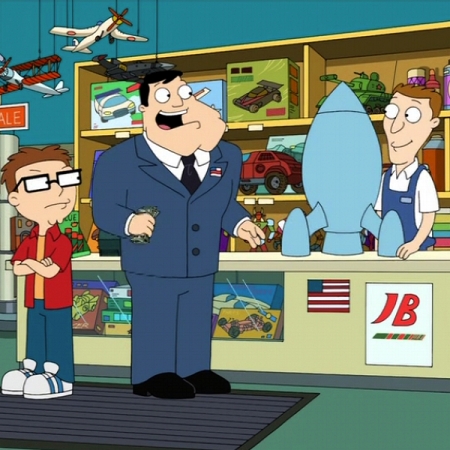
Getting back to Apple’s love of the square art, I’ve begun experimenting with squaring of the episodic artwork:

"American Dad", Season 3, Episode 13, "Red October Sky"

"American Dad", Season 3, Episode 13, "Red October Sky"

This was from a 4:3 screen shot. Cropping seems to work in almost all cases, although my experiments have been limited to American Dad, Volume 4 so far.

I recently picked up an unusual Australian TV show, Stories from the Golf. Each episode is 5 minutes long and I didn’t think that there was much to take a screen shot of, especially as there was a beautiful piece of art for each episode in the DVD menus. I took screen shots of each. None of them conformed to a particular aspect ratio, so I worked them into a 600 x 450 image. Then I had the idea to add a footer, into which I put the TV show’s name:

"Stories from the Golf", Episode 7, "Karaoke Roadie"

"Stories from the Golf", Episode 7, "Karaoke Roadie"

This has started a whole new chain of thought. I’m now experimenting with combining screen shots with a similar footer:

"Very Small Business", Episode 1, "Basics of Team Building"

"Very Small Business", Episode 1, "Basics of Team Building"

I had to crop the 16:9 image slightly to 800 x 500. There is a 300-pixel footer. This gives me the best of both worlds-screen shot and identification, all in a square package. I’ll keep doing this for a while to see if I still like it. It’s a radical change.

You can pick up the episodic art for these shows from my album-art website:

American Dad

Stories from the Golf

Very Small Business


iTunes LP for Apple TV

11 September 2009

Norah Jones: Come Away with Me: iTunes LP

I like the new LP format. It consists of a new file type (.itlp) that contains everything but the songs and some of the videos. I bought the Norah Jones. In iTunes, the album appears as a number of items. The first is the iTunes LP file, running at 175Mb. This contains the interface and it links to the songs and two of the videos. The rest are the songs of the album, plus, in this case, two videos. You can play the songs and videos in iTunes, independent of the LP interface. These are what are synced to your iPod or Apple TV. To view it in LP mode, you double-click the LP item.

The LP interface is much like a DVD, with clickable links. All the text is large, like it is with a DVD, intended to be read from across a room on a large display. It seems a no-brainer for Apple TV to support this in LP mode, but as of last night, there was no software update. This would also apply to movies with extras. It’s a virtual DVD. I’m hoping we see this on Apple TV soon.


iPhone Supports Better-than-iPod Video Quality

10 September 2009

In versions of iTunes prior to 9, videos that are compatible with a device have been displayed with black text, incompatible with grey. In iTunes 9, I was looking at the TV settings for the iPhone and noticed that all of my TV shows appeared in black. I’ve ripped all my DVDs as 768 x 576 (4:3) or 1024 x 576 anamorphic (16:9), 2500Kbps H.264, 160Kbps AAC. Up to this point, I was never able to sync a file greater than iPod resolution.

To my delight and surprise, these PAL-derived monsters synced across and played. Here’s one from Arrested Development, ripped from a Region 4 PAL DVD:

iPhone Settings Panel, Showing Compatible TV Show<br>Click to enlarge

iPhone Settings Panel, Showing Compatible TV Show

This is the only 720 HD TV show I have, Dollhouse. It’s a rip from a TV broadcast. The iPhone wouldn’t accept it:

iPhone Settings Panel, Showing Incompatible HD TV Show

iPhone Settings Panel, Showing Incompatible HD TV Show

Next I tested an iPod Classic, the true standard. Despite the apparent compatibility (black text), it wouldn’t sync anything above iPod standard:

iPod Settings Panel, Showing Incompatible TV Show

iPod Settings Panel, Showing Incompatible TV Show

What does it mean? It means less work when preparing DVD content. I can now rip one version of movies, TV shows and music videos, as long as I sync to an iPhone (and presumably, an iPod Touch). This is a pretty major step forward. Perhaps next year we’ll be able to sync 720 HD.


Where to Put iPhone 3GS Videos?

3 July 2009
Thunder Jet at Rest

Thunder Jet at Rest

Recently I strode the streets to test the new camera and ended up with some video. I’m a Flickr user and upload from iPhoto ’09. However, iPhoto would not upload the videos, which was entirely unexpected. That left the problem of what to do with them. As a quick fix, I copied them to the desktop and used the browser to upload them.

In terms of storage, iPhoto is a good place to keep videos, as they are downloaded with still photos from a still camera. You can tag them like photos. However, there are some disadvantages to storing them here. You can’t edit them. If you go into editing mode, the videos will be skipped. To play them, you double-click and that opens QuickTime Player. Here you can edit them to some degree.

Given that you can’t edit or upload video from iPhoto, I think it’s a better idea to store them in iMovie. iPhone video is in the H.264 format, which is imported into iMovie without modification. There you get all the benefits of the movie-editing controls and the storage in the iMovie library is very similar to that of iPhoto.


iTunes Store Australia Brings on the Free Stuff

12 March 2009
iTunes Store Australia Free Content

iTunes Store Australia Free Content

US iTunes Store customers have enjoyed a wide range of free items every week, including songs, music videos, TV episodes and short films. In Australia, since its inception, we have only had one free item a week–a song–until recently. Last week there was a free “making-of” clip for the series Invincible (iTunes Store link). This week, look at the bounty laid before us: first episode of Chandon Pictures, Season 2 (iTunes Store link) (this is available as a season pass), a song and the premiere of another TV show, It’s Always Sunny in Philadelphia (iTunes Store link). I’m pleased with the increased selection and the free episode of Chandon Pictures I consider especially generous as this is being posted shortly after it has been aired on its cable station. I bought the first season when it came out and this gesture by Apple has guaranteed that I will buy this season pass.


Overlooked New Feature in Apple TV 2.3.1

4 March 2009

The Americans would not have noticed this. There is a new feature of Apple TV 2.3.1 that is of interest to iTunes users outside the US: ratings badges.

Ratings have always worked on the Apple TV for parental controls, allowing parents to prevent youngsters from watching certain content, but until now there were never proper badges to reflect the ratings of another country. Early on, the Apple TV would look at the rating, e.g. MA15+, and write it out in the system font. Later, this disappeared for ratings that didn’t match US ones, namely G and PG.

Now there are proper ratings for all Australian movie and TV ratings. The US G and PG are still substituted, and the Australian ratings are nothing more than the text of the code in a box, but they are now represented on screen. I would have preferred the proper symbols though.