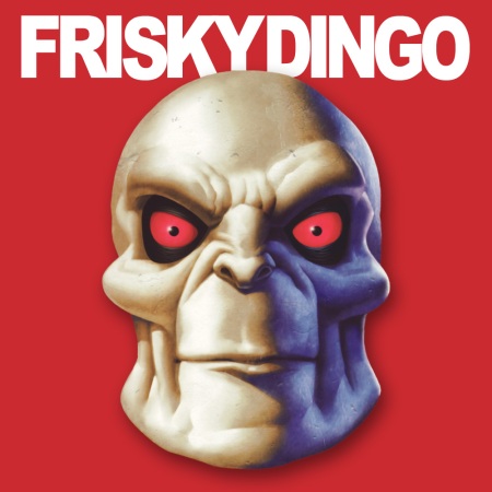
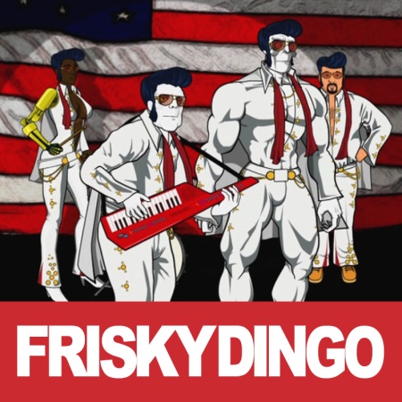
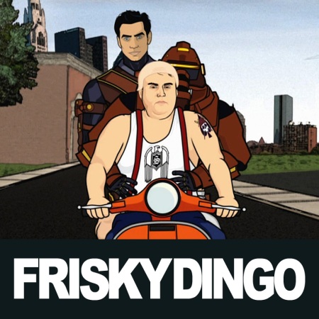
Following up my earlier post on this, I’ve now made a complete move towards square art with a footer containing the name of the TV show. I don’t know why I didn’t do this earlier. It looks so much neater than just a screen shot, because it’s always a uniform size and the footer helps with identification.
With screen shots, you’re dealing with either 4:3 or 16:9 aspect ratios (Star Wars: The Clone Wars is a rare exception–it’s presented in 2.35:1). I settled on an 800 x 800 pixel size. This allows me to scale up or down a moderate amount so as not to introduce too many artifacts. I use a footer of 300 pixels high for 16:9 content (576p scales down a little) and 200 pixels high for 4:3 (576p scales up).
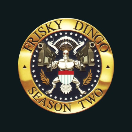
I usually use a solid colour for the footer and this is sampled from the artwork that I use for the whole season. Here’s an example:
Using a sampled colour connects the season and the episode art visually. When the season art changes, so does the footer:
It’s more work, of course, but once I’ve set up the image as a Photoshop file with the footer and the TV show title, I can then bring in my screen shots as separate layers and save out as JPEG files. That keeps all the working files together in one file, with separate output files.
You can see all the Frisky Dingo artwork on my artwork site, Album-Art.net.


 Posted by tunegardener